10,000 search results
(0.028 seconds)
- Bernhard Modern by Bitstream,
$29.99Bernhard Modern was designed in 1937 by Lucian Bernhard for ATF. It is his personal version of the small x-height engravers’ old styles popular at the time. A perennial best-seller, Bernhard Modern remains popular in a wide variety of design and typesetting uses more that 60 years after its initial release. Bitstream’s version offers a wide array of typographer sets, including alternates, extensions, small caps and italic swashes. - Bernhard Modern by Linotype,
$29.99 - Bernhard Modern by URW Type Foundry,
$35.99 Bernhard Modern was designed by Lucian Bernhard and was first cut by American Type Founders. Bernhard Modern is an unusual face with small lowercase but very tall ascenders and short descenders. Bernhard Modern was intended to hold its color and contrast without depending on the spread of ink of the letterpress method. It has an attractive pen drawn quality which has made it a popular choice for invitations and greetings cards. The Bernhard Modern font is useful for advertising and display work.
 - Bernhard Modern by Image Club,
$29.99 - Bernhard Modern SB by Scangraphic Digital Type Collection,
$26.00Since the release of these fonts most typefaces in the Scangraphic Type Collection appear in two versions. One is designed specifically for headline typesetting (SH: Scangraphic Headline Types) and one specifically for text typesetting (SB Scangraphic Bodytypes). The most obvious differentiation can be found in the spacing. That of the Bodytypes is adjusted for readability. That of the Headline Types is decidedly more narrow in order to do justice to the requirements of headline typesetting. The kerning tables, as well, have been individualized for each of these type varieties. In addition to the adjustment of spacing, there are also adjustments in the design. For the Bodytypes, fine spaces were created which prevented the smear effect on acute angles in small typesizes. For a number of Bodytypes, hairlines and serifs were thickened or the whole typeface was adjusted to meet the optical requirements for setting type in small sizes. For the German lower-case diacritical marks, all Headline Types complements contain alternative integrated accents which allow the compact setting of lower-case headlines. - Bernhard Modern EF by Elsner+Flake,
$35.00 - Bernhard by ParaType,
$30.00 The typeface was designed at ParaType (ParaGraph) in 1993 (by Tatiana Lyskova). Based on Bernhard Condensed typeface of the Bauer company, 1912 by Lucian Bernhard). For use in advertising and display typography.
 - Bernhard by Linotype,
$29.99 The German typeface artist Lucian Bernhard designed Bernhard Antiqua as the first of his many text typefaces. The first weights were produced in 1912 by the foundry Flinsch in Frankfurt am Main. Further weights followed in the 1920s, produced by the Bauersche foundry, which had acquired Flinsch in the meantime. Bernhard font is an alphabet with a marked historical influence. It brings the viewer back to the early 20th century, when the bold forms of this typeface graced advertising displays and posters. Distinguishing characteristics of this typeface are the cross of the capital W and the rounding of the capital R. Linotype's Bernhard condensed bold, with its narrow, robust forms, is best for headlines in medium and larger point sizes.
 - Modern Modern by Protimient,
$14.00 - Moderns by ITC,
$29.99 - BERNARD - Personal use only

- Benhard by Holis.Mjd,
$14.00 BENHARD is a display font with masculine characteristics suitable for old or modern styles, this font can be combined with a sans-serif font suitable for poster fonts, logos, headlines, titles on book covers, films, content and others.
 - Menhart by Monotype,
$29.99Czech designer Oldrich Menhart (1897-1962) devoted his life to making letters. He was a calligrapher, lettering artist, and typeface designer with over twenty faces to his credit. The Monotype typeface, Menhart, was the second of his designs. Menhart began work on the design in the early 1930s and turned over his final artwork to the Monotype Drawing Office in 1934. The first size cut was 14 Didot (Didot points are the traditional European system of type measure, and are roughly equivalent to the point system commonly used by today's digital fonts). The 14D font was followed by 18D and 24D, indicating that the design was considered most suitable for display work. However, a 10D size was later cut from the same master drawings at the request of a Monotype customer. Menhart's design was light and open, with an even color and a slight squareness" to its round shapes. Because the Czech alphabet has 15 accented letters, Menhart included these diacritics as an integral part of his design, not as an afterthought. As a result, accented copy set in Menhart has a cohesive quality rarely seen in other typefaces. Monotype's new digital release of Menhart is the first revival since the hot metal fonts were cut. Menhart Display is based on the original Monotype drawings, while a slightly heavier, re-spaced version has been created for text sizes. Both versions offer the full capabilities of the OpenType format, such as the automatic insertion of old style figures, ligatures and small caps. In addition to English, the extended character set supports most Central European and many Eastern European languages. One of Menhart's lifelong goals was to share the richness of his Czech culture by drawing typefaces that uniquely served Czechoslovakia literature. In his words: "I believe that a Czech style of type comes above all from the spirit in which it was designed, which gives it its 'signature,' and not so much from decorative composition, and even less from the geographic location of its creation." The typeface Menhart is a tribute to his values. Now, Menhart Pro and Menhart Display Pro capture the unique personality of this timeless design while greatly extending its range of use. " - Bernhardt™ - Unknown license

- Bernhard Fashion by URW Type Foundry,
$35.99 Bernhard Fashion is a fine line sans serif typeface designed by Lucian Bernhard in 1929. Use the Bernhard Fashion font for posters, book covers, promotional material and packaging.
 - Bernhard Fashion by Monotype,
$40.99The German-born designer Lucian Bernhard designed Bernhard Fashion in 1929. An American" typeface, Bernhard's original design was created for the American Type Founders (ATF). It bespeaks the spirit of the roaring 20s. The hairline-thin letters exhibit elongated ascenders (but not descenders), and many stylized elements. The capital letters also all descend visibly below the baseline. In text, the extra large capitals seem almost like drop caps. This typeface is best used sparingly in text. Largely set headlines will allow readers to enjoy the fashionable quality of Bernhard Fashion's design." - Bernhard Tango by Bitstream,
$29.99An elegant and disciplined script popular for fifty years. - Bernhard Fashion by Tilde,
$39.75 - PL Bernhardt by Monotype,
$29.99Ed Benguiat drew the PL Bernhardt font which was released in 1970. PL Bernhardt was modeled after a 1930/1931 design by Lucian Bernhard. All terminals on non-vertical strokes are diagonal so that lower and uppercase X looks as though they are dancing. - Bernhard Antique by URW Type Foundry,
$35.99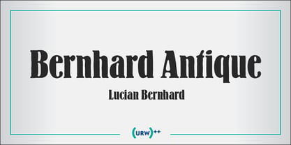
- Bernhard Tango by Tilde,
$39.75 - Bernhard Gothic by URW Type Foundry,
$35.99 Original design by Lucian Bernhard
 - Bernhard Fashion by Bitstream,
$29.99 This is an American face designed by Lucian Bernhard for ATF in 1929. An extra light face with tall ascenders and stylized bars that extend off to the left. The lower-case sits on the baseline and the much-taller-than-normal capitals have an imaginary baseline that sits about two-thirds of the distance from the real baseline to the bottom of the EM.
 - Bernhardt Standard by Linotype,
$40.99Bernhardt Standard, which was designed in 2003 by Julius de Goede, is a flowing Bastarde script. Bastarde is one of the sub-categories of Blackletter typefaces. The term Blackletter refers to typefaces that have evolved out of Northern Europe’s medieval manuscript tradition. Often called gothic, or Old English, these letters are identifiable by the traces of the wide-nibbed pen stroke within their forms. Of all of the various sorts of Blackletter styles, Bastarde scripts are the most flowing, or Italic. The first Bastarde typefaces, cut in the late 1400s, were based on French handwriting styles, especially those styles popular in Burgundy. The flowing nature of Bernhardt Standard makes it similar to some other sorts of Blackletter typefaces as well. Bernhardt Standard, because of its handwritten roots, is also similar to Kurrent, a style of handwriting that was popular in Germany prior the 20th Century. Bernhardt Standard is a very calligraphic face, suitable for formal applications. This typeface would be an excellent choice for certificates or awards. The old style figures in the font allow for nice short settings of text as well. - Bernhard Cursive by RMU,
$25.00 Bernhard Cursive ExtraBold is one of Lucian Bernhard's most expressive fonts which are worth to get preserved for now and times to come. An ideal font face for advertisements, posters, flyers, titles and subtitles.
 - Bernhard Script by profonts,
$41.99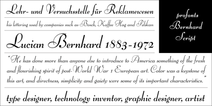
- Bernhard Signature by Jonahfonts,
$40.00I started to work at the Bernhard Studio in 1952 to 1959 in New York. I helped with some type designs and many other projects, this two tiered signature was added on all of Bernhard’s art that was produced in the past and in his later years. In the 50’s I thought Bernhard’s Gothic face was quite a bit outdated but as you may know it has become one of todays most used faces. His signature is based on his Bernhard Gothic Font. With todays computer technology I have digitized the caps and added lower case glyphs with lower ascenders and other slight changes. - Bernhard Blackletter by RMU,
$25.00 Bernhard Blackletter can be compared to a tuba, adding its deep bass sound to the orchestra of blackletter fonts. This font contains a bunch of useful ligatures, and to access all, it is recommended to activate both Standard and Discretionary Ligatures. You find the round s on the # key, and typing the combination N-o-period and activating the OT feature Ordinals gets you the numero sign.
 - Bernat by Designova,
$15.00 BERNAT is a unique display typeface perfect for headlines, big text, brandings, logotypes & graphic design purposes such as posters, flyers, and advertisements. This all-caps font can be an excellent choice for creating outstanding logos, promotional content, and marketing presentations that bring uniqueness and freshness. The font is very flexible in terms of your creativity, you can adjust the letterspacing to design unique textual presentations, especially for creating amazing logotypes and branding designs. Please see the examples shown above to get an idea of the capability of this typeface. Extra Features: BERNAT features a Stylistic Alternatives Set of 22 glyphs covering major glyphs which will give you more possibilities to create unique design combinations. The font comes with extended language support including Western European, Central European, and South-Eastern European character sets (a total of 290 glyphs).
 - Moderna - 100% free

- Moldern by Arterfak Project,
$18.00 Moldern is a modern-style serif with stylish ligature explorations. Moldern combines decorative, vintage, and minimalist style with a bold weight that is suitable for display. This font has a classy impression, feminine and expensive. You can apply this font for branding, fashion, logo, magazine, books, labels, invitations, cards, and more! Here's what you'll get : Uppercase Lowercase Stylistic set Stylistic alternates Ligatures Number & symbols Multilingual support Thank you for watching. Happy designing!
 - Moderna by Los Andes,
$16.00 Moderna is a sans serif family inspired in simplicity of Modernism. Its contruction neutral and clean has been especially designed for short texts, headlines, logos and branding. With sixteen variants includes unicase version, some alternate characters, arrows and labels.
 - Moderately by Alex Jacque,
$35.00 Introducing Moderately, a chunky and friendly typeface that makes a bold statement. This high-impact font is specifically crafted for designers seeking a display typeface with presence, perfect for applications where large, expressive type is a must. The defining features of Moderately include a generous x-height, soft curves, and tight spacing, ensuring a punchy and fresh aesthetic. Moderately is a deliberate departure from your contemporary sans with nary a straight line to see, embracing the organic and dynamic qualities reminiscent of blocky Art Nouveau typefaces, notably inspired by the works of Alfred Roller. While drawing influence from psychedelic / Art Nouveau revival typefaces of the 1960s, Moderately strikes a contemporary balance, delivering a design that is both impactful and approachable. Each glyph in Moderately attempts to maximize its space within the em square, incorporating slim carve outs for counters and apertures. The name "Moderately" adds a touch of irony, as this typeface is anything but plain – it exudes affable confidence and subtle flair. Created with versatility in mind, Moderately offers broad support for Latin-based languages, ensuring its adaptability for a wide range of creative projects.
 - Modern Vision - 100% free

- Advokat Modern - 100% free

- Odd Modern - Unknown license

- Zillah Modern - Unknown license

- Moderne Fraktur - Personal use only

- Eidetic Modern by PSY/OPS,
$36.00 Eidetic Modern is the sanserif counterpart to Eidetic Neo. Both families were developed in tandem, however the Modern was the first to be published by PSY/OPS [1997]. Eidetic Modern's features -- gently tapered stems, buffed corners and junctures, vertical stress, non-classical proportions -- combine to create a unique, contemporary humanist sans.
 - Craw Modern by GroupType,
$19.00 Craw Modern was designed by Freeman Craw in 1958 and first released by The American Typefounders Company, (ATF). In typography, 'Modern' is a style of typeface (classification) developed in the late 18th century that continued through much of the 19th century. Characterized by high contrast between thick and thin strokes and flat serifs. Bodoni is among the most popular of the Moderns. Moderns are also known as Didone and New Antiqua.


Page 1 of 250Next page